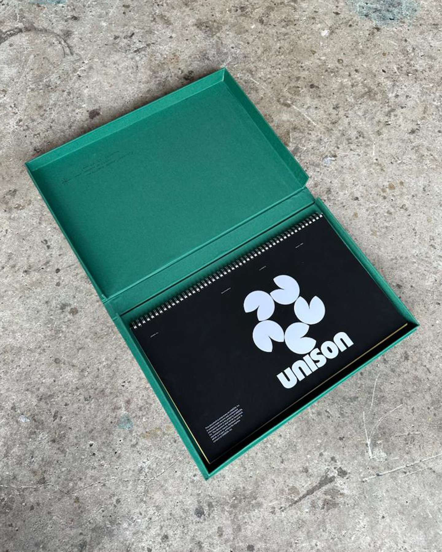
UNISON
︎SAN FRANSISCO, 2022
BRAND DESIGN | ART DIRECTION | UX DESIGN
Leading Brand Identity for UNISON, a tech start-up pushing the capabilities of every day consumer hardware.
︎︎︎ IDEA TO EXECUTION
︎SAN FRANSISCO, 2022
BRAND DESIGN | ART DIRECTION | UX DESIGN
Leading Brand Identity for UNISON, a tech start-up pushing the capabilities of every day consumer hardware.
︎︎︎ IDEA TO EXECUTION
1 CONCEPT AND VISION
UNISON’s brand identity is built on the belief that technology should enhance real life - not replace it. It’s goal fraes Immersive experiences are not as escape, but as a temporary descent into possibility; a place to explore, create, and return from with a renewed perspective that can be used as a tool for every day life. UNISON aims to create a platform for this exchange, bringing people and ideas together in unison to build new worlds that inform the one we already live in.
UNISON’s brand identity is built on the belief that technology should enhance real life - not replace it. It’s goal fraes Immersive experiences are not as escape, but as a temporary descent into possibility; a place to explore, create, and return from with a renewed perspective that can be used as a tool for every day life. UNISON aims to create a platform for this exchange, bringing people and ideas together in unison to build new worlds that inform the one we already live in.
2 ARTISTIC INSPIRATIONS
The identity is inspired by the metaphor of a lake; a calm surface that invites entry, with depth and richness beneath that can only be accessed by being in it. Diving into the lake represents immersion in new experiences; resurfacing symbolizes seeing everyday life in a new light.
This metaphor shapes the entire visual system. The UNISON symbol is formed from five lily pads, individual elements coming together as one, reflecting collaboration and modular creation. This is enhanced with its supporting icon system; the duck, frog, and fish represents different ways of engaging with the same world, above and below the surface. A playful, organic color palette further reinforces warmth, curiosity, and approachability, deliberately contrasting the rigid visual language of traditional tech brands.
3 EXECUTION AND OUTCOME
Through early digital presence, founder storytelling, and public tech conversations, the brand has reached tens of thousands of viewers, resonating with audiences drawn to a more human vision of immersive technology. It stands out from its competitors, receiving investment from the likes of Naval Ravikant and Lachy Groom. The result is an identity that invites immersion, encourages creation, and always makes space for return.
Through early digital presence, founder storytelling, and public tech conversations, the brand has reached tens of thousands of viewers, resonating with audiences drawn to a more human vision of immersive technology. It stands out from its competitors, receiving investment from the likes of Naval Ravikant and Lachy Groom. The result is an identity that invites immersion, encourages creation, and always makes space for return.