ERROLSON HUGH X BOSIDENG
︎WORLDWIDE, 2024
BRAND DESIGN | PACKAGING DESIGN
Leading Packaging Design for Bosideng’s most anticipated collaboration with designer Errolson Hugh, the founder of ACRONYM®
︎︎︎ IDEA TO EXECUTION
︎WORLDWIDE, 2024
BRAND DESIGN | PACKAGING DESIGN
Leading Packaging Design for Bosideng’s most anticipated collaboration with designer Errolson Hugh, the founder of ACRONYM®
︎︎︎ IDEA TO EXECUTION
1 CONCEPT AND VISION
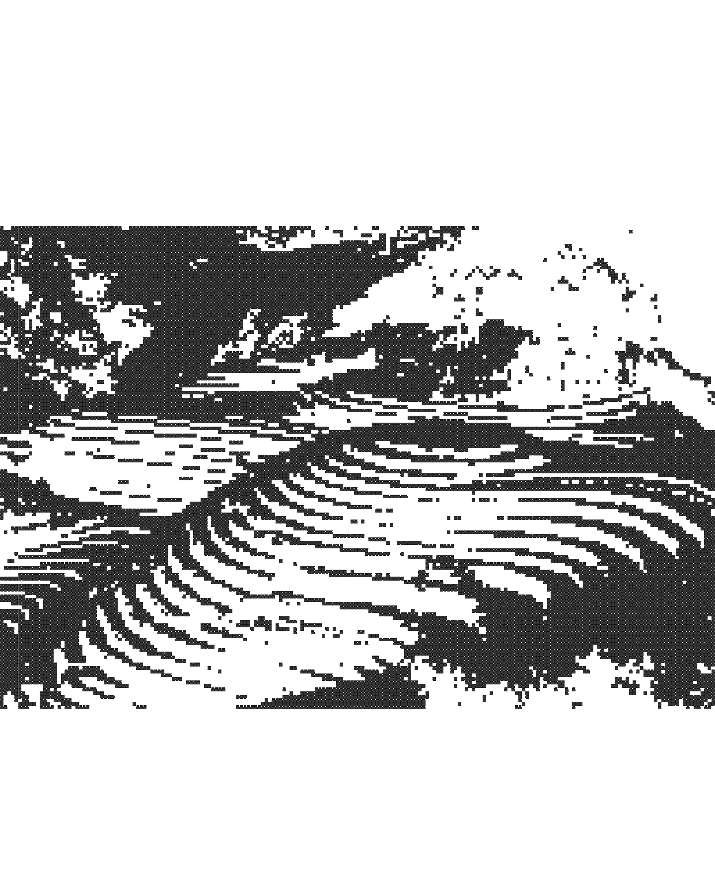
From the outset, the vision for the packaging was to act as a physical extension of the campaign world - not a secondary asset, but an equal storyteller. With imagery photographed by long-time collaborator Bafic, the campaign explored a deliberate tension between future and past, constructed and organic, precision and imperfection. Ellen sought to translate this conceptual duality into packaging that could visually and tactually echo the collection’s narrative, ensuring cohesion across image, object, and experience.
From the outset, the vision for the packaging was to act as a physical extension of the campaign world - not a secondary asset, but an equal storyteller. With imagery photographed by long-time collaborator Bafic, the campaign explored a deliberate tension between future and past, constructed and organic, precision and imperfection. Ellen sought to translate this conceptual duality into packaging that could visually and tactually echo the collection’s narrative, ensuring cohesion across image, object, and experience.
2 ARTISTIC INSPIRATIONS
The creative direction drew inspiration from the contrasts found in our built environment: architectural forms weathered by time, man-made structures softened by nature, and contemporary silhouettes informed by historical references. These opposing forces became the emotional core of the packaging - a balance between progress and provenance. The campaign photography reinforced this dialogue, pairing stark compositions with organic textures, allowing the packaging to feel both forward-looking and rooted in material history.
The creative direction drew inspiration from the contrasts found in our built environment: architectural forms weathered by time, man-made structures softened by nature, and contemporary silhouettes informed by historical references. These opposing forces became the emotional core of the packaging - a balance between progress and provenance. The campaign photography reinforced this dialogue, pairing stark compositions with organic textures, allowing the packaging to feel both forward-looking and rooted in material history.
3 EXECUTION AND OUTCOME
The final packaging launched in tandem with the campaign imagery, forming a unified visual language across physical and digital touchpoints. The packging featured across brand channels and in store experience, contributing to the collection’s wider visibility and reinforcing its conceptual clarity. By aligning packaging design so closely with the campaign’s thematic contrasts, the project successfully elevated the product from container to artefact - an object that embodied the collection’s exploration of the contrasts between structure and nature, only further strengthening the overall narrative impact of the launch.
The final packaging launched in tandem with the campaign imagery, forming a unified visual language across physical and digital touchpoints. The packging featured across brand channels and in store experience, contributing to the collection’s wider visibility and reinforcing its conceptual clarity. By aligning packaging design so closely with the campaign’s thematic contrasts, the project successfully elevated the product from container to artefact - an object that embodied the collection’s exploration of the contrasts between structure and nature, only further strengthening the overall narrative impact of the launch.